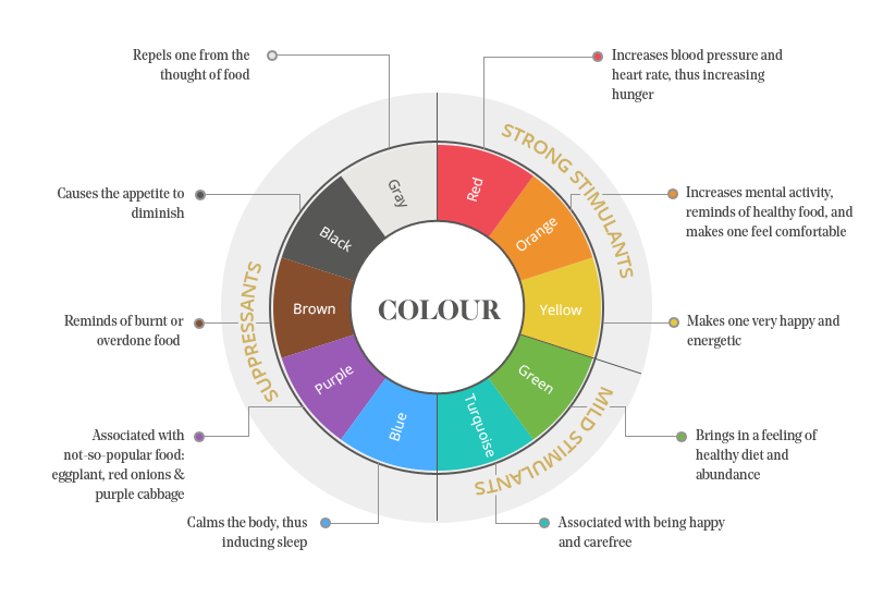
Commercial kitchen designs are well crafted to tap the senses of the diner at the right note, as they should know exactly who their target clientele are, and hence they would design accordingly. Restaurants know this, and they take great pains to use it to send the right information. Colour, for example, is a powerful tool for influencing customer behavior. In fact for commercial hotel designs, the color wheel can be divided into three sections which depends on their effect on appetite.They are namely; Strong Stimulus, Mild Stimulus and Suppressants.

1). Strong Appetite Stimulants
You would be wondering why most restaurants use red in some form or other in their design. Well, it has been proved without any doubt that this shade of red is the most effective color for restaurant designs as this color stimulates the appetite very well
As it is well known that our ancestors began life as hunters and gatherers, and as a reptilian response they used to be attracted to this red color which used to be found in abundance signalling the presence of dense energy, sugar packed fruits and vegetables.
Orange and yellow are also known to be appetite stimulators and hence these are also used abundantly in commercial kitchen designs. Yellow depicts happiness and satisfaction of a full stomach, along with this color yellow helps the brain to secrete serotonin while it awaits the food you are waiting for.
Orange and yellow are also appetite stimulants. Yellow is associated with happiness,which is usually associated with a full stomach. When you see yellow, therefore, your brain secretes serotonin in anticipation of the food you’re about to eat.
2.) Mild Appetite Stimulants
Since the color green is the edible color, it is a strong stimulant, although plants are merely fibrous and not sugar-packed, providing a push of energy, they are associated with health. So is the turquoise known as a mild stimulant.
3.) Appetite Suppressants
The colors black, blue, purple and brown are referred to as appetite suppressants, for example black causes the appetite to diminish, brown represents burnt or overcooked food, while blue induces sleep by calming the body and purple does represent only a few vegetables like the egg plant, red onions and purple cabbage which are also rarely used. Another important reason for these colors not being used in commercial kitchen designs is that they are not the color of nature. In olden days the colors black, brown, blue and purple represented that the food was rotten or poisonous and kept away from these colors.
Just as our brain responds well to the red, yellow and orange, so is the usage of these colors in commercial kitchen designs. As mentioned earlier certain colors generally invoke the same reaction in most people. Color has been found to be one of the most visible elements of hotel design, that makes it a good enough place to begin any discussion. Some earth tones like clay, sand, mushroom and bark are relaxing types which provide a sense of stability. It might look surprising to hear that some non-earthy palettes are a very current trend. Most commercial kitchen designs do follow the above trends that are in vogue today.


